If there is anything better than beers and gears, it might be liquor and chrome. We are, as you know, experts and quite experienced at most anything of this nature. After all, we are screen printers. It seems as though we developed a theme over the years, for better or worse. We have a client, who, to us, is a pretty big customer. In fact, one of our largest. These guys happen to hold several substantial western brands. That said, as you might expect, there are a number of shirts being printed for these brands, and we get to print plenty of them.
Season after season, we develop new looks and designs with the designers and merchandisers. We work hand-in-hand with them and have done some really nice lines. The most recent project was a bit different, though. Obviously, branding is extremely important to these folks and anything new comes with scrutiny.
We ran into a couple of the VPs at a recent trade show. They, too were exhibiting, but had a chance to walk the rest of the show and got a load of the “wall” in our booth. They really had no idea of the scope of what garment decoration was all about. Each embellishment was examined carefully and after several, “I think this is my favorite!” exclamations, the fellows decided on several inspirations to apply to their brands. (If you haven’t seen it, Graphic Elephants regularly exhibits at The NBM Show and our display is what we call our body of work.)
This month, we will look at one of the projects that came out of that conversation. Our inspiration comes from the classic AC/DC print we did years ago for a merchandiser with that appropriate licensing.
Snap to it!
This job was a rush (like everything else). But that was okay because we are used to that. The go ahead from the client arrived before we had that first cup o’ joe on a Thursday. After we poured ourselves a hot one, we went to work. Luckily, we were given the freedom to mix and match whatever parts we would like on this project. Gotta love that! That’s what makes it fun.
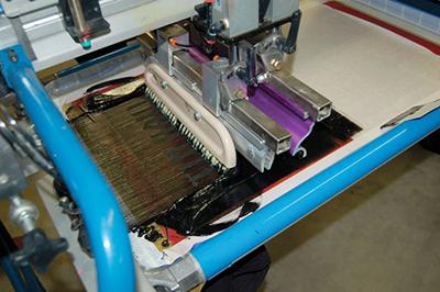 The graphics were designed to be very solid and heavy to support the execution of the brushed effect. In production, the author replaced the squeegee with a wallpaper brush on that screen to intensify the effect.
First, we needed to pick a font that was similar to the AC/DC angular typestyle that they liked. Of course, that is a trademarked logo, so something similar would have to suffice. After a bit of online research we found what we were looking for. We selected our type tool and created a type box so we could set our verbiage, “Tin Haul.”
Once our sharp thick font tool is selected, we can then create outlines in Photoshop. This will be our inside (or fill). To build the outline, we made a stroke, copied the art, and pasted it back in where we could open the stroke menu to adjust the weight to our liking.
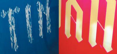
To add the fill texture, we first pulled up a distress pattern and selected small groups that we could group and stretch. We repeated this until we had a large group that we could elongate from top to bottom. Back to our artwork board: we created a layer and pasted our brush texture over the fill shape. Then, we selected the areas for our texture, copied it to the new layer, and pasted in front. To make a clipping mask, we selected it and made it a compound path, then selected the pattern.
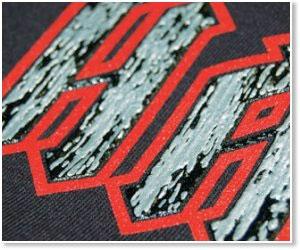
Because of the simplicity of the graphics, we would add some dimensional effects to the print. To achieve this, the fill would be a chrome or brushed aluminum effect. This technique can only be executed if the graphics are fairly solid and heavy. We needed a little meat here and had it. No thin lines or dainty serifs on the type.
One of the great things about Illustrator is that everything is knocked out of the subsequent layer, which is especially helpful here, where the dimension of the inks need gutters for spacing and ink transfer. The easiest way to execute this step is to create another color that will not be used around the type as an outline, giving us the space we will need for our dimensional effects on press. We output just three film positives, and it was off to screen making.
Creating chrome
The outline and the under-base for the fill were exposed on three screens, standard 156/54 threads per inch with a quality dual cure wet emulsion stencil. The fill areas went on an 83 tpi, 70 micron thread screen with a 400 micron capillary film pure photopolymer stencil. All screens were in the 30 to 35 N/cm2 tension range. We ended up with five screens total.
The inks required some special mixing. We needed a flat black that would go under our dimensional ink to provide a platform. For the blood red outline, we chose PMS 186. The black gel would be a standard HD clear mixed with matte black 75/25. The silver aluminum ink was made using a chrome or liquid silver and mixing in the HD clear at about 90/10.
We set the job up beginning with the flat inks, black and red, first. We flashed at that point and cooled the print. The red was printed again to get a nice bright red. The black gel followed, and printed with a wallpaper brush in place of the squeegee to get a textured, chrome effect that had peaks and valleys. Another flash and cool station, then the silver gel printed on top, using the same print technique to create our brushed chrome look to the final print. Incremental off-contact distances were critical in this print. We began at 30/1000 and ended near an eighth of an inch for the final screen.
The print turned out very cool and we ran a couple hundred for sales samples and merchandising prototypes. The initial response to the design and several others was very strong. Or so we were told. According to the customer, the product is selling very well and production orders are due in May. We shall see!

Season after season, we develop new looks and designs with the designers and merchandisers. We work hand-in-hand with them and have done some really nice lines. The most recent project was a bit different, though. Obviously, branding is extremely important to these folks and anything new comes with scrutiny.
We ran into a couple of the VPs at a recent trade show. They, too were exhibiting, but had a chance to walk the rest of the show and got a load of the “wall” in our booth. They really had no idea of the scope of what garment decoration was all about. Each embellishment was examined carefully and after several, “I think this is my favorite!” exclamations, the fellows decided on several inspirations to apply to their brands. (If you haven’t seen it, Graphic Elephants regularly exhibits at The NBM Show and our display is what we call our body of work.)
This month, we will look at one of the projects that came out of that conversation. Our inspiration comes from the classic AC/DC print we did years ago for a merchandiser with that appropriate licensing.
Snap to it!
This job was a rush (like everything else). But that was okay because we are used to that. The go ahead from the client arrived before we had that first cup o’ joe on a Thursday. After we poured ourselves a hot one, we went to work. Luckily, we were given the freedom to mix and match whatever parts we would like on this project. Gotta love that! That’s what makes it fun.
First, we needed to pick a font that was similar to the AC/DC angular typestyle that they liked. Of course, that is a trademarked logo, so something similar would have to suffice. After a bit of online research we found what we were looking for. We selected our type tool and created a type box so we could set our verbiage, “Tin Haul.”
Once our sharp thick font tool is selected, we can then create outlines in Photoshop. This will be our inside (or fill). To build the outline, we made a stroke, copied the art, and pasted it back in where we could open the stroke menu to adjust the weight to our liking.
To add the fill texture, we first pulled up a distress pattern and selected small groups that we could group and stretch. We repeated this until we had a large group that we could elongate from top to bottom. Back to our artwork board: we created a layer and pasted our brush texture over the fill shape. Then, we selected the areas for our texture, copied it to the new layer, and pasted in front. To make a clipping mask, we selected it and made it a compound path, then selected the pattern.
Because of the simplicity of the graphics, we would add some dimensional effects to the print. To achieve this, the fill would be a chrome or brushed aluminum effect. This technique can only be executed if the graphics are fairly solid and heavy. We needed a little meat here and had it. No thin lines or dainty serifs on the type.
One of the great things about Illustrator is that everything is knocked out of the subsequent layer, which is especially helpful here, where the dimension of the inks need gutters for spacing and ink transfer. The easiest way to execute this step is to create another color that will not be used around the type as an outline, giving us the space we will need for our dimensional effects on press. We output just three film positives, and it was off to screen making.
Creating chrome
The outline and the under-base for the fill were exposed on three screens, standard 156/54 threads per inch with a quality dual cure wet emulsion stencil. The fill areas went on an 83 tpi, 70 micron thread screen with a 400 micron capillary film pure photopolymer stencil. All screens were in the 30 to 35 N/cm2 tension range. We ended up with five screens total.
The inks required some special mixing. We needed a flat black that would go under our dimensional ink to provide a platform. For the blood red outline, we chose PMS 186. The black gel would be a standard HD clear mixed with matte black 75/25. The silver aluminum ink was made using a chrome or liquid silver and mixing in the HD clear at about 90/10.
We set the job up beginning with the flat inks, black and red, first. We flashed at that point and cooled the print. The red was printed again to get a nice bright red. The black gel followed, and printed with a wallpaper brush in place of the squeegee to get a textured, chrome effect that had peaks and valleys. Another flash and cool station, then the silver gel printed on top, using the same print technique to create our brushed chrome look to the final print. Incremental off-contact distances were critical in this print. We began at 30/1000 and ended near an eighth of an inch for the final screen.
The print turned out very cool and we ran a couple hundred for sales samples and merchandising prototypes. The initial response to the design and several others was very strong. Or so we were told. According to the customer, the product is selling very well and production orders are due in May. We shall see!
About the Author
- Email Address lon@graphicelephants.com
Industry consultant Lon Winters is president of Print This, Inc. and Graphic Elephants, LLC. During more than twenty years in screen printing, he has won more than 40 international industry awards. Those include SGIA Golden Image Awards, Printwear Awards, Impressions Awards, and FESPA Honors. He is an honorary Golden Image judge; has published numerous articles and monthly columns; and leads seminars and workshops for a wide array of industry professionals.
Since the day he began his career by reclaiming screens, Lon has been involved in virtually every aspect of screen printing and embroidery. After managing operations large and small, Lon launched businesses dedicated to training, and consulting.
Print This conducts popular seminars and workshops around the world for manufacturers, vendors, and garment decorators.
Graphic Elephants is a screen print and embroidery design and development studio specializing in new techniques for clients with high-end work and short lead times.
Located in Elizabeth, Colorado, Lon can be reached by phone at 303-910-0477 and by email at lon@graphicelephants.com. His website is www.GraphicElephants.com.