Developing Maximum Color Strength when Using Four Color Process
by Mark Coudray
True process color printing on textiles has been around for about 30 years. Any screen printer who has tried it knows that printing halftone color on a fabric surface is much different than if it were printed on paper. Textile surfaces are not even. They are not solid. They move around. There is almost an equal chance of printing on air as there is printing on a thread. These are some of the factors that make it so difficult to achieve a good process color print on a shirt. These factors, plus others that follow, limit the range and number of colors that we can reproduce.
To solve these problems, printers simply add more colors to the printing sequence. In the early days, a 6 color automatic was considered the high end. Four and five color presses were much more common. Today, ten or twelve colors are more the norm, and an eight color press is just barely enough to get by. With this being the case, there are still a great many 4-6 color manual presses in the market. In recent months there has been a resurgence of interest in printing limited color pallets on these presses. For this reason I would like to revisit some of the areas that will help the printer with limited press heads achieve maximum color development in his images.
Process color reproduction was invented over 150 years ago and has remained largely unchanged during this time. The technology to make separations has improved, and the cost has dropped dramatically (as has most technology.) But the fundamental basis of using cyan, magenta, yellow, and black ink to obtain a reasonable color reproduction has not. It is the limitations of this reproduction color model that we need to investigate.
Where we get into trouble is when we think of four color process as the method by which we reproduce full color as we see it. This is impossible. A healthy human eye can distinguish between 4 and 10 million colors, depending on age, gender, lighting conditions, and so on. We are able to reproduce somewhere between 250 and 1000 individual, discrete colors using four color process on a typical heavyweight cotton t-shirt. There is a big difference between what the eye sees and what we can replicate. To improve this, we typically add spot colors or bump plates. This is necessary and perfectly legitimate as we try and improve the color range to the point where it matches offset lithography. Even then, it is not even close to perfect.
Be this as it may, our job is to get the most out of the stations we have . What follows are the more important considerations that will help you obtain more color before you add an additional screen (or more,) and allow you to get the greatest possible color range from the inks you are using.
Dot Gain is the Enemy
A fundamental cause of limited color range is dot gain. This occurs when the printed halftone dot grows beyond the original size. Some of this can be controlled, and some is part of the printing process. The object of using halftones is to fool the eye into believing that more colors are being printed than there really are. When we print a dot, and surround that dot with another color, or the background white of a garment, our eye mixes the surround color with the printed dot, and perceives a new third color. For instance, if we print a 20% magenta dot on field of 100% yellow, our eye will mix the two and our brain will perceive a light orange. If that same magenta dot were printed on a 100% cyan field, the perceived color would be a light lavender. However, if that magenta dot were to grow to say 60%, due to dot gain, the new perceived colors would be dark orange and purple respectively. The gain causes color shifting.
This has a disastrous effect on the total number of colors that we can simulate. The very lightest pastel colors disappear all together. It is typical for the very smallest dots (usually around 5% at 65 lpi,) to gain up to 20-25%. This means that you will never get a light pastel, only medium values. On the other end of the tone range, any dot over about 70-75% will gain until it becomes a solid value. Therefore, dark colors tend to collapse. Any detail that existed in the darker colors would be completely gone. What we have just described is tone range compression. Where we compress the reproduction range of color for 0% (pure white) to 100% (total solid.) Now instead of giving over 100 steps, it is compressed between 20% and 75%, almost a 50% reduction of the available reproduction values.
The visual effect of this is a dark, muddy print. It lacks contrast, meaning that it looks flat and devoid of detail. Our general reaction is "blahhh." As I look at typical work from printers everywhere, this is the norm, and not the exception. To improve the visual appearance, printers will add halftone exender base to their process colors in and attempt to lighten the final print. This may seem logical, but the end result is that we now have a lighter, muddy print. The cause is still the same, dot gain.
In order to keep our printed colors strong, bright, and clear, you must have enough color intensity in the process color inks. The stronger these inks are, the better the reds, violets, purples, greens, and blues you will achieve. Without color strength in the basic inks, you must either settle for poor quality, or add additional intermediate touch plates to make up for the weak process colors. For example, adding a spot Pantone 185 Red because you cannot achieve a decent red from your process yellow, cyan, and magenta.
To obtain better results from your process colors it is necessary to reduce the amount of gain in the printed image. This can be done with a number of techniques. All of them should be used to reduce the gain as much as possible.
1. Make sure Photoshop Settings are Correct
At the very beginning of the process it is crucial to make sure that the separation set-up is correct. If you are working with a CMYK file, all of the dot gain parameters have been established. If this was done for lithographic settings, you are cooked. To verify that the values are correct, go to >Color Settings and make sure that they are set for SWOP Uncoated, 38% Dot Gain, Medium Black Generation, and Black Limit 100%. These setting will give you the latitude you need to accommodate the type of dot gain that is typical for our printing process.
If you inherited a CMYK file from your customer and you do not know what the dot gain values were set for, you can simulate what happens on press by setting the values to those indicated above. If the image becomes very dark on the monitor, you know the file was converted for paper printing. To fix this, you will have to go to >Image>Adjust>Curves, and lower the midpoint value of the diagonal line from 50% to 33% and the 75% dot to 57% (See Figure 1). This will compensate for the improperly prepared file.
Using the finest mesh possible will help you to limit the amount of ink you are printing. The more ink volume you deposit, the more ink there is to mash around. The idea is to limit this. A fine mesh (280.34 or 305.34 where 34 is the thread diameter in microns,) give you a better chance at controlling this. Printers new to process often underestimate the mesh count they should use. This is primarily due to the fact they are not accustomed to working with fine meshes. While a normal mesh might be 160, a fine mesh might mean 230. This is not good enough.
Keep Mesh Tension High
Low tension is a significant contributor to dot gain. For this reason it is highly desirable to keep the mesh at 25 N/cm or higher. With high tension, lower squeegee pressure is needed to achieve a good print. Mesh is elastic. With a low tension, there is a tendency to stretch the mesh under printing conditions.
This elongation causes a fabric roll to develop in front of the squeegee blade. This roll is nothing more than an accumulation of loose mesh as squeegee pressure continues to elongate the fabric over the print stroke. The resulting snap back at the end of the squeegee pass can blur the image and cause the halftone dot to smear, resulting in doubling or dot gain.
A second contributing factor of low tension is the need for a higher squeegee pressure to achieve an adequate ink deposit and penetration. When the mesh stretches, it slows the flow of the ink, decelerating much like the way a circus net slows the fall of the falling trapeze artist. The slowing ink hangs up in the mesh and fails to clear the screen. To overcome this, the printer adds more pressure, resulting in a now uncontrolled ink transfer and dot gain.
3. Use Sharp Triple Durometer Squeegees
One of the easiest ways to get good secondary color is to have the ink clear the screen easily. This is best accomplished with a triple duometer squeegee. These are laminated blades with 75/90/75 durometer layers. The stiff center layer helps to concentrate the minimized squeegee pressure directly at the print surface. The minimal deflection of the blade allows for a complete shearing of the ink and clearing of the ink from the screen. The result is a smooth, even ink deposit, and good color development.
To test for sharpness, gently pull your fingertip over the edge of the blade. You should be able to feel the individual ridges of your fingertips. If you cannot, the blade is too dull and needs to be sharpened.
4. All Process Color Inks are not the Same
Process inks vary dramatically between brands. Spending a little more will make a huge difference in the brightness and strength of your images. When considering process inks, there are three main considerations. The first is the overall strength or density of the ink needs to be high enough. Many of the press ready mixes lack sufficient density to deliver good reds, greens, and blues. A strong rich primary process color is critical. When looking at the ink in the opened can or bucket, the Magenta should appear almost maroon, the Cyan a very deep navy blue, and the Yellow almost like an amber. When these colors are printed down to their final application strength on the garment, they will appear as we would expect them. However, in the masstone they will be very dark. If the color in the pail looks like what you would expect on the garment, it will print too weak.
The second consideration is the purity of the color. This is essential for the development of good secondary color (reds, greens, and blues.) The only way to determine this is to overprint solid values of each of the process colors onto other colors. This will immediately show you what you can expect from the secondary colors. If the reds, greens, and blues that develop are deep and rich, you have a base set you can start with.
The third consideration is the base the ink is made from. Low gain base is one of the main ways to minimize dot gain. The current measured gain varies between 28% to over 45%, under ideal print conditions. It is unlikely you will print under ideal conditions. To get an idea of where you will be, add 5% to the range. I consider my own experience to be pretty good, and I us 38% for our value with excellent results. If you pick a value which is too high, the print will look light. This is not a problem. Simply add some more squeegee pressure to get the print to the point it needs to be.
If you use a value which is too low, the print will be too dark. Now you are in trouble. As you back the pressure out, you lose pentration into the garment, and the image will still be too dark. The moral is, error on the high side.
You can expect to pay more per gallon for ink that meets these criteria. In reality it really does not make all that much difference. Calculations of ink consumption over long runs with process color images printed through 305.34 mesh showed the cost per print varied between three cents and five cents per image when using the most expensive inks. Unless you are doing very long run contract work, the difference between $40.00 per gallon process color and $60.00 per gallon is insignificant. By comparison, many UV process color inks for graphic screen printing are over $110.00 per gallon with some approaching $200.00. As with good cooking, it all starts with good ingredients.
5. Always us a White Printer
This is my number one recommendation for counteracting dot gain. The use of a highlight white printer not only improves the contrast range of the separation, it can actually counteract dot gain when it happens. Here is how it works.
Process color inks are transparent by nature. They work partly on the process of physically mixing two or more colors to make new colors. When you use a white printer, the printed white is translucent. When mixed with the pure process color, it tends to convert the transparency to a pastel. It actually brings the ink value back to the natural pastel state that has been destroyed by the dot gain. The key to using a white printer is to make sure it was prepared properly and that it be of the proper translucent value. A good starting point is to use a commercially prepared Halftone White or Fine White. If you intend on making the white yourself, start by mixing one part opaque white with three parts Halftone Base. This is extremely important that you use Halftone base so as to minimize dot gain of the printed halftone white.
6. Use a Good Grade Garment
Experienced process printers have a saying, "you can't print on air." This simply means that you need enough fiber mass to hold the halftone dot. Whenever a dot misses a thread, it will stay on the backside of the screen, either partially, or completely. When it is finally deposited onto the garment, it will have the effect of being printed twice, effectively double stroked. It is clear this will lead to gain. The higher the fiber mass, the fewer missed dots, and a lower gain will result from this cause.
In recent years extensive research and development has been conducted by the major mills to create surfaces specifically for process color printing. Do some homework and find out which ones are best. A good starting point would be to consider garments with a fabric weight of 6 oz or higher as a starting point.
7. Keep Your Printing Technique Consistent
You can do yourself a big favor by keeping your printing technique consistent. Besides the obvious aspect of repeatability, there is a very important benefit of a consistent technique, it is easy to spot variation. When you change the print order, pressure, flood , and so on, you never have a point of return. Every print is a new experience, and consequently, the color is all over. Good color development has its' foundation in finding a technique and sticking to it.
8. Avoid Unnecessary Flashing
A very detrimental common practice is to have too much flash drying on press. This can be in the form of multiple flashes, excessive flash duration, or a flash unit that is too hot. Heat is the supreme enemy of good color. It causes viscosity changes in the ink, making it flow easier and sending dot gain values off the map. It also changes the way colors combine, lift off, and mix. When you use too much flash, you enter a world of constant variation where nothing is predictable. When printing process color on light garments, the only time you should consider flashing is just prior to the Black. The reason is to help minimize fiberlation. All other colors should be printed wet-on-wet with no flashing.
There is one possible exception to this rule, and it should be used with caution. Some of the very low dot gain halftone bases print better when the printing platens are warm, but not hot. For those types of ink, a flash is often set to a low temperature specifically to heat the platens to about 130° F to aid in consistent flow and deposit. A noncontact pyrometer (IR Heat Gun) is often used to check for the right temperature. This technique is used by experienced process printers and is carefully controlled.
9. Keep a Printed Sample Within Sight
The last technique is to make sure that you have an approved visual sample of what the client is expecting mounted directly on the press. Color drifts over time for all the reasons we have explored here. Unfortunately, the human eye becomes somewhat dulled over time when it sees the same image over and over. Without a mounted image to compare your current print to, drift will be a certainty. This is a very low tech step, but critical toward maintaining good color once you have obtained the approved sample
These are not the only techniques you can use to dramatically improve the visual sharpness and clarity of your images. They are the major factors that will help you to create work that is visually superior to your competition. Improving the range and color of your prints is an ongoing quest. The initial improvements are quite apparent. Beyond these ten major recommendations the improvements become smaller, less visible, and more difficult to obtain, incremental in nature. How far you go depends on how determined you are to produce visually superior work. Many markets do not demand this attention to detail. Certainly general commercial custom work falls well within the boundaries of these generalized guidelines. You and your customers will be the judges as to how far you need to go.

by Mark Coudray
True process color printing on textiles has been around for about 30 years. Any screen printer who has tried it knows that printing halftone color on a fabric surface is much different than if it were printed on paper. Textile surfaces are not even. They are not solid. They move around. There is almost an equal chance of printing on air as there is printing on a thread. These are some of the factors that make it so difficult to achieve a good process color print on a shirt. These factors, plus others that follow, limit the range and number of colors that we can reproduce.
To solve these problems, printers simply add more colors to the printing sequence. In the early days, a 6 color automatic was considered the high end. Four and five color presses were much more common. Today, ten or twelve colors are more the norm, and an eight color press is just barely enough to get by. With this being the case, there are still a great many 4-6 color manual presses in the market. In recent months there has been a resurgence of interest in printing limited color pallets on these presses. For this reason I would like to revisit some of the areas that will help the printer with limited press heads achieve maximum color development in his images.
Process color reproduction was invented over 150 years ago and has remained largely unchanged during this time. The technology to make separations has improved, and the cost has dropped dramatically (as has most technology.) But the fundamental basis of using cyan, magenta, yellow, and black ink to obtain a reasonable color reproduction has not. It is the limitations of this reproduction color model that we need to investigate.
Where we get into trouble is when we think of four color process as the method by which we reproduce full color as we see it. This is impossible. A healthy human eye can distinguish between 4 and 10 million colors, depending on age, gender, lighting conditions, and so on. We are able to reproduce somewhere between 250 and 1000 individual, discrete colors using four color process on a typical heavyweight cotton t-shirt. There is a big difference between what the eye sees and what we can replicate. To improve this, we typically add spot colors or bump plates. This is necessary and perfectly legitimate as we try and improve the color range to the point where it matches offset lithography. Even then, it is not even close to perfect.
Be this as it may, our job is to get the most out of the stations we have . What follows are the more important considerations that will help you obtain more color before you add an additional screen (or more,) and allow you to get the greatest possible color range from the inks you are using.
Dot Gain is the Enemy
A fundamental cause of limited color range is dot gain. This occurs when the printed halftone dot grows beyond the original size. Some of this can be controlled, and some is part of the printing process. The object of using halftones is to fool the eye into believing that more colors are being printed than there really are. When we print a dot, and surround that dot with another color, or the background white of a garment, our eye mixes the surround color with the printed dot, and perceives a new third color. For instance, if we print a 20% magenta dot on field of 100% yellow, our eye will mix the two and our brain will perceive a light orange. If that same magenta dot were printed on a 100% cyan field, the perceived color would be a light lavender. However, if that magenta dot were to grow to say 60%, due to dot gain, the new perceived colors would be dark orange and purple respectively. The gain causes color shifting.
This has a disastrous effect on the total number of colors that we can simulate. The very lightest pastel colors disappear all together. It is typical for the very smallest dots (usually around 5% at 65 lpi,) to gain up to 20-25%. This means that you will never get a light pastel, only medium values. On the other end of the tone range, any dot over about 70-75% will gain until it becomes a solid value. Therefore, dark colors tend to collapse. Any detail that existed in the darker colors would be completely gone. What we have just described is tone range compression. Where we compress the reproduction range of color for 0% (pure white) to 100% (total solid.) Now instead of giving over 100 steps, it is compressed between 20% and 75%, almost a 50% reduction of the available reproduction values.
The visual effect of this is a dark, muddy print. It lacks contrast, meaning that it looks flat and devoid of detail. Our general reaction is "blahhh." As I look at typical work from printers everywhere, this is the norm, and not the exception. To improve the visual appearance, printers will add halftone exender base to their process colors in and attempt to lighten the final print. This may seem logical, but the end result is that we now have a lighter, muddy print. The cause is still the same, dot gain.
In order to keep our printed colors strong, bright, and clear, you must have enough color intensity in the process color inks. The stronger these inks are, the better the reds, violets, purples, greens, and blues you will achieve. Without color strength in the basic inks, you must either settle for poor quality, or add additional intermediate touch plates to make up for the weak process colors. For example, adding a spot Pantone 185 Red because you cannot achieve a decent red from your process yellow, cyan, and magenta.
To obtain better results from your process colors it is necessary to reduce the amount of gain in the printed image. This can be done with a number of techniques. All of them should be used to reduce the gain as much as possible.
1. Make sure Photoshop Settings are Correct
At the very beginning of the process it is crucial to make sure that the separation set-up is correct. If you are working with a CMYK file, all of the dot gain parameters have been established. If this was done for lithographic settings, you are cooked. To verify that the values are correct, go to >Color Settings and make sure that they are set for SWOP Uncoated, 38% Dot Gain, Medium Black Generation, and Black Limit 100%. These setting will give you the latitude you need to accommodate the type of dot gain that is typical for our printing process.
If you inherited a CMYK file from your customer and you do not know what the dot gain values were set for, you can simulate what happens on press by setting the values to those indicated above. If the image becomes very dark on the monitor, you know the file was converted for paper printing. To fix this, you will have to go to >Image>Adjust>Curves, and lower the midpoint value of the diagonal line from 50% to 33% and the 75% dot to 57% (See Figure 1). This will compensate for the improperly prepared file.
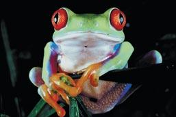
CMYK file provided by client with unknown dot gain
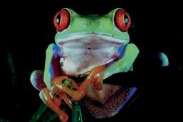
Frog 40% Gain
This is the same file when viewed with Color Settings set to CMYK Dot Gain 40%. Notice how much darker the image will be when screen printed.
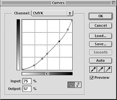
Image>Adjust>Curve

Corrected Litho file now ready for screen printing with CMYK
Using the finest mesh possible will help you to limit the amount of ink you are printing. The more ink volume you deposit, the more ink there is to mash around. The idea is to limit this. A fine mesh (280.34 or 305.34 where 34 is the thread diameter in microns,) give you a better chance at controlling this. Printers new to process often underestimate the mesh count they should use. This is primarily due to the fact they are not accustomed to working with fine meshes. While a normal mesh might be 160, a fine mesh might mean 230. This is not good enough.
Keep Mesh Tension High
Low tension is a significant contributor to dot gain. For this reason it is highly desirable to keep the mesh at 25 N/cm or higher. With high tension, lower squeegee pressure is needed to achieve a good print. Mesh is elastic. With a low tension, there is a tendency to stretch the mesh under printing conditions.
This elongation causes a fabric roll to develop in front of the squeegee blade. This roll is nothing more than an accumulation of loose mesh as squeegee pressure continues to elongate the fabric over the print stroke. The resulting snap back at the end of the squeegee pass can blur the image and cause the halftone dot to smear, resulting in doubling or dot gain.
A second contributing factor of low tension is the need for a higher squeegee pressure to achieve an adequate ink deposit and penetration. When the mesh stretches, it slows the flow of the ink, decelerating much like the way a circus net slows the fall of the falling trapeze artist. The slowing ink hangs up in the mesh and fails to clear the screen. To overcome this, the printer adds more pressure, resulting in a now uncontrolled ink transfer and dot gain.
3. Use Sharp Triple Durometer Squeegees
One of the easiest ways to get good secondary color is to have the ink clear the screen easily. This is best accomplished with a triple duometer squeegee. These are laminated blades with 75/90/75 durometer layers. The stiff center layer helps to concentrate the minimized squeegee pressure directly at the print surface. The minimal deflection of the blade allows for a complete shearing of the ink and clearing of the ink from the screen. The result is a smooth, even ink deposit, and good color development.
To test for sharpness, gently pull your fingertip over the edge of the blade. You should be able to feel the individual ridges of your fingertips. If you cannot, the blade is too dull and needs to be sharpened.
4. All Process Color Inks are not the Same
Process inks vary dramatically between brands. Spending a little more will make a huge difference in the brightness and strength of your images. When considering process inks, there are three main considerations. The first is the overall strength or density of the ink needs to be high enough. Many of the press ready mixes lack sufficient density to deliver good reds, greens, and blues. A strong rich primary process color is critical. When looking at the ink in the opened can or bucket, the Magenta should appear almost maroon, the Cyan a very deep navy blue, and the Yellow almost like an amber. When these colors are printed down to their final application strength on the garment, they will appear as we would expect them. However, in the masstone they will be very dark. If the color in the pail looks like what you would expect on the garment, it will print too weak.
The second consideration is the purity of the color. This is essential for the development of good secondary color (reds, greens, and blues.) The only way to determine this is to overprint solid values of each of the process colors onto other colors. This will immediately show you what you can expect from the secondary colors. If the reds, greens, and blues that develop are deep and rich, you have a base set you can start with.
The third consideration is the base the ink is made from. Low gain base is one of the main ways to minimize dot gain. The current measured gain varies between 28% to over 45%, under ideal print conditions. It is unlikely you will print under ideal conditions. To get an idea of where you will be, add 5% to the range. I consider my own experience to be pretty good, and I us 38% for our value with excellent results. If you pick a value which is too high, the print will look light. This is not a problem. Simply add some more squeegee pressure to get the print to the point it needs to be.
If you use a value which is too low, the print will be too dark. Now you are in trouble. As you back the pressure out, you lose pentration into the garment, and the image will still be too dark. The moral is, error on the high side.
You can expect to pay more per gallon for ink that meets these criteria. In reality it really does not make all that much difference. Calculations of ink consumption over long runs with process color images printed through 305.34 mesh showed the cost per print varied between three cents and five cents per image when using the most expensive inks. Unless you are doing very long run contract work, the difference between $40.00 per gallon process color and $60.00 per gallon is insignificant. By comparison, many UV process color inks for graphic screen printing are over $110.00 per gallon with some approaching $200.00. As with good cooking, it all starts with good ingredients.
5. Always us a White Printer
This is my number one recommendation for counteracting dot gain. The use of a highlight white printer not only improves the contrast range of the separation, it can actually counteract dot gain when it happens. Here is how it works.
Process color inks are transparent by nature. They work partly on the process of physically mixing two or more colors to make new colors. When you use a white printer, the printed white is translucent. When mixed with the pure process color, it tends to convert the transparency to a pastel. It actually brings the ink value back to the natural pastel state that has been destroyed by the dot gain. The key to using a white printer is to make sure it was prepared properly and that it be of the proper translucent value. A good starting point is to use a commercially prepared Halftone White or Fine White. If you intend on making the white yourself, start by mixing one part opaque white with three parts Halftone Base. This is extremely important that you use Halftone base so as to minimize dot gain of the printed halftone white.
6. Use a Good Grade Garment
Experienced process printers have a saying, "you can't print on air." This simply means that you need enough fiber mass to hold the halftone dot. Whenever a dot misses a thread, it will stay on the backside of the screen, either partially, or completely. When it is finally deposited onto the garment, it will have the effect of being printed twice, effectively double stroked. It is clear this will lead to gain. The higher the fiber mass, the fewer missed dots, and a lower gain will result from this cause.
In recent years extensive research and development has been conducted by the major mills to create surfaces specifically for process color printing. Do some homework and find out which ones are best. A good starting point would be to consider garments with a fabric weight of 6 oz or higher as a starting point.
7. Keep Your Printing Technique Consistent
You can do yourself a big favor by keeping your printing technique consistent. Besides the obvious aspect of repeatability, there is a very important benefit of a consistent technique, it is easy to spot variation. When you change the print order, pressure, flood , and so on, you never have a point of return. Every print is a new experience, and consequently, the color is all over. Good color development has its' foundation in finding a technique and sticking to it.
8. Avoid Unnecessary Flashing
A very detrimental common practice is to have too much flash drying on press. This can be in the form of multiple flashes, excessive flash duration, or a flash unit that is too hot. Heat is the supreme enemy of good color. It causes viscosity changes in the ink, making it flow easier and sending dot gain values off the map. It also changes the way colors combine, lift off, and mix. When you use too much flash, you enter a world of constant variation where nothing is predictable. When printing process color on light garments, the only time you should consider flashing is just prior to the Black. The reason is to help minimize fiberlation. All other colors should be printed wet-on-wet with no flashing.
There is one possible exception to this rule, and it should be used with caution. Some of the very low dot gain halftone bases print better when the printing platens are warm, but not hot. For those types of ink, a flash is often set to a low temperature specifically to heat the platens to about 130° F to aid in consistent flow and deposit. A noncontact pyrometer (IR Heat Gun) is often used to check for the right temperature. This technique is used by experienced process printers and is carefully controlled.
9. Keep a Printed Sample Within Sight
The last technique is to make sure that you have an approved visual sample of what the client is expecting mounted directly on the press. Color drifts over time for all the reasons we have explored here. Unfortunately, the human eye becomes somewhat dulled over time when it sees the same image over and over. Without a mounted image to compare your current print to, drift will be a certainty. This is a very low tech step, but critical toward maintaining good color once you have obtained the approved sample
These are not the only techniques you can use to dramatically improve the visual sharpness and clarity of your images. They are the major factors that will help you to create work that is visually superior to your competition. Improving the range and color of your prints is an ongoing quest. The initial improvements are quite apparent. Beyond these ten major recommendations the improvements become smaller, less visible, and more difficult to obtain, incremental in nature. How far you go depends on how determined you are to produce visually superior work. Many markets do not demand this attention to detail. Certainly general commercial custom work falls well within the boundaries of these generalized guidelines. You and your customers will be the judges as to how far you need to go.
About the Author
- Email Address mark.coudray@coudray.com
- Phone 805-541-1521
Mark Coudray
Mark is founder and President of Coudray Serigraphics, a textile screen printing company and Coudray Graphic Technologies, a digital imaging and prepress supplier to the industry. He was inducted into the Academy of Screen Printing Technology in 1989 and has served as Chairman of the ASPT twice. In addition, Mark is the recipient of 18 SGIA Golden Image Awards, 2 Swormstedt Awards, Magnus Award, and the Parmele Award (2001). He is past SGIA Chairman (2000). He has served a total of 24 years as an SGIA Director. Mark is a noted industry author with Screen Printing, Impressions, Print Wear, Images, and other trade publications with over 275 articles, columns, and technical papers as well as an industry presenter at tradeshows, conventions, and technical symposiums. He is best known for his extensive work in controlling color halftone printing, quality, and production management of the screen printing process.
Mark is founder and President of Coudray Serigraphics, a textile screen printing company and Coudray Graphic Technologies, a digital imaging and prepress supplier to the industry. He was inducted into the Academy of Screen Printing Technology in 1989 and has served as Chairman of the ASPT twice. In addition, Mark is the recipient of 18 SGIA Golden Image Awards, 2 Swormstedt Awards, Magnus Award, and the Parmele Award (2001). He is past SGIA Chairman (2000). He has served a total of 24 years as an SGIA Director. Mark is a noted industry author with Screen Printing, Impressions, Print Wear, Images, and other trade publications with over 275 articles, columns, and technical papers as well as an industry presenter at tradeshows, conventions, and technical symposiums. He is best known for his extensive work in controlling color halftone printing, quality, and production management of the screen printing process.