A systematic approach makes color- matching faster and more accurate.
by Mark Coudray
Your ability to see and communicate color is critical to professionally reproducing designs. In our highly competitive market, understanding color makes the difference between a delighted client and one who is disappointed with the final result.
For many, screen printing is just an extension of their artistic side, so color is something they understand. For others, it's a complete mystery. I frequently see prints with stock ink colors, right out of the can. When a design calls for blue, whatever is in the can is what gets printed. Never mind that the Pantone Matching System® has at least 142 separate and distinguishable blues available—284 if you count matte and gloss versions. The same can be said for any of the primary and secondary colors.
How do you communicate color with your clients and artists? The ability to clearly describe a color is important in how a printed image reproduces. For instance, if you can't properly describe a color to a separator, how can you expect him to match it? Having dealt with hundreds of frustrated artists and production managers, I have seen a definite need for better communication when describing, matching, and implementing color.
Understanding color becomes even more important when evaluating a color and matching it without a formula or system. What happens when the color you need falls between formula samples? Do you know what to add or delete to match the target color? True, the Pantone system is available from most major ink companies. However, that is only part of the story. Screen printing deposits between six and 20 times the amount of ink that lithography does, depending on substrate and mesh count. Even if you follow the formulas precisely, the visual match to the color chip may be significantly different, which is why the color matches are called Pantone simulations. You're left to either match the color chip provided or use the supplied formula.
Understanding The Components Of Color
The color wheel (see Figure 1) can be broken into two groups: primary and secondary colors. Primary colors are those that cannot be mixed by adding more than one component; in other words, two or more other colors can't be mixed to achieve a primary color. The primary colors for printing are yellow, magenta, and cyan. These correspond roughly to the primaries of yellow, red, and blue, which are a common and easy—but incorrect and less precise—way to think of primaries. Yellow, magenta, and cyan more accurately reflect the primary colors.
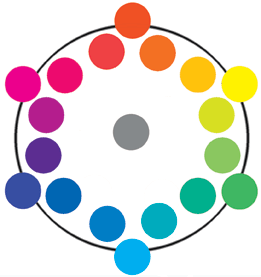
Figure 1 - The conventional color wheel uses primary color positions of yellow, cyan, and magenta. The secondary color positions are blue, red, and green. The tertiary colors fall between the primary and secondary colors.
The three secondary colors are made by mixing two primary colors adjacent on the color wheel. Mixing yellow and magenta makes red-orange; cyan and yellow make green; and cyan and magenta make blue-violet. Although it's less precise to do so, secondary colors are commonly called red, green, and blue.
Complementary colors are those opposite each other on the color wheel. Complementary pairs are cyan-red, magenta-green, and yellow-blue. (See Figure 2).
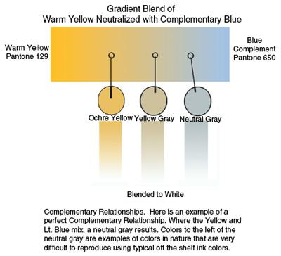
Figure 2 - In this example of a perfect complementary relationship, yellow and light blue combine to yield neutral gray. Colors to the left of the neutral gray are examples of neutral colors that are extremely difficult to reproduce using typical, off-the-shelf ink.
'Seeing Color'
To effectively see color, approach it systematically. Our brains are poor at accurately remembering exact hues. We remember tonal values generally, but without a reference, exact matches are impossibleÑeven for professional color matchers. This makes it even more important to have some type of system.
Many color models can be used to describe the color we see. A core model based on the Munsell system starts with a backbone of black at the bottom and white at the top. This represents the value, or luminosity, of the colors to be matched. The higher the value, the lighter the color. The value is determined by the amount of light the color reflects. White reflects 100% and black reflects 0%. Naturally, neither is perfectly obtainable under practical conditions.
Within this model we can bisect the core with circular planes of color. We are most familiar with the example of a color wheel. Each plane can be a circle with all the colors of that value on it. (See Figure 3.) The actual color name is referred to as the hue. The hues vary as we move around the wheel. The center of the circular plane is gray, and the perimeter represents the most saturated version of the color. Saturation is the purity of the color. It is also referred to as the chroma, or intensity. All colors can be described using this 3-D model of hue, saturation, and value.
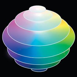
Figure 3 - All colors can be described using this 3-D model of hue, saturation, and value. Each layer represents a color wheel at a given brightness, or lightness. Maximum saturation of each layer is at the outer edge, with the center having no saturation. The core of the sphere represents a grayscale value that changes from black at the bottom to white at the top.
The next step is to determine how saturated the color is. The easiest way to do this is to compare the color against color chips from an ink company. The brighter or cleaner a color is, the more saturated it is. If there is white mixed into the color, it is tinted and looks milky. If black has been added, it is shaded and looks dark and dead. An easy way to familiarize yourself with a saturation, tint, and shade color model is to look at a page in a Pantone book. The middle color is the most saturated one on a page. Colors higher on a page add white and tint; those lower on the page add black and shade.
Once you have determined the color's purity and value, identify the component colors used to achieve it. This gets a little trickier but is not impossible. Begin by finding the dominant hue, which should be either a primary or secondary color. Look at your color chart and pick the closest match.
All colors on the wheel can be moved to the right or left. For instance, a perfect yellow would have no color cast at all. If the yellow you intend to match is warm, it is called a red shade yellow. An example is Golden Yellow or a color like Pantone 123. If the yellow is cold, it is called a green shade yellow. An example is Primrose Yellow or a color like Pantone 395. You can have red shade blue, green shade blue, yellow shade red, and blue shade red. This is confusing at first, but look at the color wheel and you will see it makes perfect sense.
Before trying a color match, following a few simple guidelines will save you time and money. The first tip is to mix a small amount of ink on a piece of white cardboard as a test. Determine your relative percentages of color—and write them down—before mixing (e.g., a quarter-size amount of red shade yellow and a dime-size amount of yellow shade red). To adjust the lightness or darkness, desaturate the colors by adding white or black.
The second tip is to start with the lightest color and mix small quantities of the darker colors into them. It takes vast amounts of white to lighten a dark color, so mixing in this order keeps you from ending up with five gallons of light gray when you only needed a pint.
When mixing a color by beginning with the primary component cast away from the target color, add gray or the color's complement. For example, when matching a bright, clean orange, the dominant hue is a red shade yellow, to which a yellow shade red is added to get the match. If you start with a green shade yellow or blue shade red, adding the complement, blue, to the orange will dull or gray the color.
After obtaining the most saturated version of your target color, adjust the value. To lighten the color, add white. This is not as simple as it sounds, as white comes in many levels of opacity. The more opaque the color, the less needed. When color matching, use a special version of white called tinting white by adding five parts clear base to one part opaque white. (Caution: This is only a guideline. Good results may fall between a white-to-base ratio of 1-to-3 to as low as 1-to-10, depending how opaque your white is.) It's too opaque if adding white makes your color excessively chalky.
There are two ways to decrease the value of a color (darkening.) The first is adding black. This is my least favorite way of lowering the value because even small amounts of black have a large effect, killing the color faster than anything I know. To minimize this, create a shading black in the same way you made the tinting white, except that a 1:6 to 1:12 ratio should work. Use transparent black so the color shows through. The lower the value of the color you are matching, the easier it is to shade with black. Blues, greens, and purples fall into this category.
The second way to decrease the value of a color is adding its complement. This is the best way to darken the color while maintaining its color characteristics. Use complementary adjustment for yellows, oranges, and reds. This is especially important for yellow because adding black causes a distinct shift to green. Adding violet or blue purple in extremely small amounts to yellow results in beautiful wheat shades, unattainable any other way. Important: when mixing complements into a color to lower the value, make sure that you use complementary colors that are darker than the original color. To make a dark green, you would need to add a dark magenta to the green. Pastel or light complements will lighten or simply neutralize the saturation of the origninal color. In the case of our yellow example here, the best way to do this is to dilute blue-violet with nine parts halftone clear to one part color. Adding the complement at 1/10 its original concentration makes it much easier to control. When shading a color with black or the complement, be sure to use small amounts of the darkening color as it is extremely easy to overpower a chromatic color. The lighter the initial color, the more sensitive it is.
Color matching can be time-consuming and difficult, especially without an understanding of color. It takes time to learn to "see color" because it's not a purely analytical skill, requiring subjective judgment more often than not. But by approaching it systematically, it is much less intimidating. With some practice and documentation, you will become quite good at it and be on your way to better, faster, and more accurate matching.

About the Author
- Email Address mark.coudray@coudray.com
- Phone 805-541-1521
Mark is founder and President of Coudray Serigraphics, a textile screen printing company and Coudray Graphic Technologies, a digital imaging and prepress supplier to the industry. He was inducted into the Academy of Screen Printing Technology in 1989 and has served as Chairman of the ASPT twice. In addition, Mark is the recipient of 18 SGIA Golden Image Awards, 2 Swormstedt Awards, Magnus Award, and the Parmele Award (2001). He is past SGIA Chairman (2000). He has served a total of 24 years as an SGIA Director. Mark is a noted industry author with Screen Printing, Impressions, Print Wear, Images, and other trade publications with over 275 articles, columns, and technical papers as well as an industry presenter at tradeshows, conventions, and technical symposiums. He is best known for his extensive work in controlling color halftone printing, quality, and production management of the screen printing process.