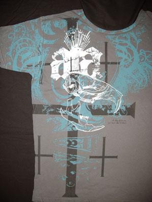
As ya’all know, we love to write about a few of our favorite things. Aside from wine, women and song (a.k.a. liquor, ladies and rock ‘n’ roll), we also share our passion for a little horse power here and there as well. Those passions are shared with another we write about occasionally to keep everything in proper perspective and balance our lives. The Christian-Edge.com part of our business, as you might imagine, tries to be involved in a number of outreach and other Christian projects. Awhile back, a new clothing line developer came to us with some ideas for building a Christian apparel line called All The Above clothing or ATA. They had about 16 designs or rough ideas they were hoping to develop onto fashion garments. The ATA line had “aggressive” graphic ideas with some unusual and trendy applications. One such style was called Jawbone. We’re not sure where the name comes from, but hey, it’s their project, they can call it what they want. It was an all-over design that covered the collar, sleeves and wrapped completely around the shirt. We were all over it.
Vector creations
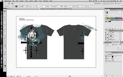
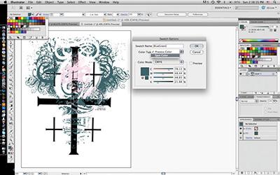
ATA provided art and diagrams that were very usable. We say this because so often we are rebuilding from scratch. As the developer it is our responsibility to interpret what the customer is trying to accomplish or understand the spirit of the project. The direction was easy for us to understand.
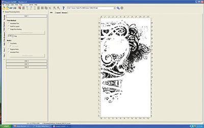
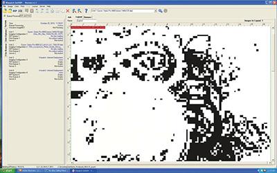
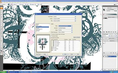
The client provided us with vector art, for a change, that was built in process colors. No worries though, we would just need to change it to spot colors. We added a distress filter to break up the image as it was going to be printed on garment-washed and nicked-up distressed charcoal-colored Ts, so the art would need to match that beat up texture. We would ultimately print three colors, so created a spot color for each and identified them with the color we would be printing—simple enough. Once all colors were converted to spot colors, we printed out our separations right out of Illustrator. Once in the RIP, we would make sure the process colors were turned off and only those spots were to print to film.
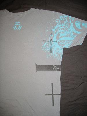
Because we would print an all-over wrap around, our image size was huge. Our 4880 only prints up to 16.5" in width, so we would print in multiple 16"-wide sections and tile them together on a light table, using a loop to make sure they were lined up perfectly. We would only need to do this with the film for the teal color. The other two, black and white, were extra-long but would stay within the 16.5" width.
Reinventing the frame
After the output of all our color plates we headed into the screen department to prepare N-272 tpi (threads per inch) screens at a high tension of 45 N/cm for all colors. Two screens would be exposed on one of our standard size (23" X 36") retensionable roller frames. The black was long but not all that wide and the white was relatively small, so only the one screen would need to be oversizedi. The all-over imagery was exposed on a 36" X 36" roller frame that we built by disassembling two 23" X 36" frames and using all four long sides to reassemble an over-sized frame (that just barely fit into the exposure unit).
We have several platens and jigs built for specialty printing and applications. In this case, we used a 40" X 40" platen we built with an 1/8" neoprene rubber applied to its surface. This cushion helped us print over the seams, leaving a clean ink deposit with no ink clumps or missing areas. (Ink clumps is the technical term.)
Wide load
We laid the entire shirt right on top of the platen, not threading it as we would when loading a more traditional print. To get the Ts to stay together, we sprayed a simple heavy starch into the middle of the opened garment and the transfer machine, which made the garments as flat and as smooth as possible for printing over the sleeves, collars and the for the full-bleed print. The front application was executed on a manual press.
Because ATA wanted a full wrap, we exposed the two wrap (or back) colors on N-272 screens as well, properly located for the automatic. In both the manual and auto application, we printed parts of the image on the platens and covered the wet ink with clear tape. This would be the template by which we were able to know where to load our garments. Loading was slow in order to get the front and back to line up perfectly, but we were able to get paid appropriately for our efforts both on the run as well as the setup.
All the inks would be cut with 50 to 60 percent fashion-soft base or curable reducer. The relatively high mesh and the thinned ink result in an ultra soft-handi print on the already soft and distressed garment. We would print the teal color first, followed by black and the white last in order to make it the most opaque and prevent it from lifting off from subsequent screens.
All garments would have labels cut out and the ATA brand printed into the neck. That was the easy part, whereas each size, country of origin and contents would also need to be in each shirt, which is a different label. We chose what we call a thin dark gray. Thin to keep it soft enough not to irritate the wearer’s neck and dark gray because it works on almost any color garment with enough contrast to read on both dark and light garments.
The Jawbone design and the other 15 designs that made up the line were quite a project, but ultimately the body of work was quite impressive.

Vector creations
ATA provided art and diagrams that were very usable. We say this because so often we are rebuilding from scratch. As the developer it is our responsibility to interpret what the customer is trying to accomplish or understand the spirit of the project. The direction was easy for us to understand.
The client provided us with vector art, for a change, that was built in process colors. No worries though, we would just need to change it to spot colors. We added a distress filter to break up the image as it was going to be printed on garment-washed and nicked-up distressed charcoal-colored Ts, so the art would need to match that beat up texture. We would ultimately print three colors, so created a spot color for each and identified them with the color we would be printing—simple enough. Once all colors were converted to spot colors, we printed out our separations right out of Illustrator. Once in the RIP, we would make sure the process colors were turned off and only those spots were to print to film.
Because we would print an all-over wrap around, our image size was huge. Our 4880 only prints up to 16.5" in width, so we would print in multiple 16"-wide sections and tile them together on a light table, using a loop to make sure they were lined up perfectly. We would only need to do this with the film for the teal color. The other two, black and white, were extra-long but would stay within the 16.5" width.
Reinventing the frame
After the output of all our color plates we headed into the screen department to prepare N-272 tpi (threads per inch) screens at a high tension of 45 N/cm for all colors. Two screens would be exposed on one of our standard size (23" X 36") retensionable roller frames. The black was long but not all that wide and the white was relatively small, so only the one screen would need to be oversizedi. The all-over imagery was exposed on a 36" X 36" roller frame that we built by disassembling two 23" X 36" frames and using all four long sides to reassemble an over-sized frame (that just barely fit into the exposure unit).
We have several platens and jigs built for specialty printing and applications. In this case, we used a 40" X 40" platen we built with an 1/8" neoprene rubber applied to its surface. This cushion helped us print over the seams, leaving a clean ink deposit with no ink clumps or missing areas. (Ink clumps is the technical term.)
Wide load
We laid the entire shirt right on top of the platen, not threading it as we would when loading a more traditional print. To get the Ts to stay together, we sprayed a simple heavy starch into the middle of the opened garment and the transfer machine, which made the garments as flat and as smooth as possible for printing over the sleeves, collars and the for the full-bleed print. The front application was executed on a manual press.
Because ATA wanted a full wrap, we exposed the two wrap (or back) colors on N-272 screens as well, properly located for the automatic. In both the manual and auto application, we printed parts of the image on the platens and covered the wet ink with clear tape. This would be the template by which we were able to know where to load our garments. Loading was slow in order to get the front and back to line up perfectly, but we were able to get paid appropriately for our efforts both on the run as well as the setup.
All the inks would be cut with 50 to 60 percent fashion-soft base or curable reducer. The relatively high mesh and the thinned ink result in an ultra soft-handi print on the already soft and distressed garment. We would print the teal color first, followed by black and the white last in order to make it the most opaque and prevent it from lifting off from subsequent screens.
All garments would have labels cut out and the ATA brand printed into the neck. That was the easy part, whereas each size, country of origin and contents would also need to be in each shirt, which is a different label. We chose what we call a thin dark gray. Thin to keep it soft enough not to irritate the wearer’s neck and dark gray because it works on almost any color garment with enough contrast to read on both dark and light garments.
The Jawbone design and the other 15 designs that made up the line were quite a project, but ultimately the body of work was quite impressive.
About the Author
- Email Address lon@graphicelephants.com
Industry consultant Lon Winters is president of Print This, Inc. and Graphic Elephants, LLC. During more than twenty years in screen printing, he has won more than 40 international industry awards. Those include SGIA Golden Image Awards, Printwear Awards, Impressions Awards, and FESPA Honors. He is an honorary Golden Image judge; has published numerous articles and monthly columns; and leads seminars and workshops for a wide array of industry professionals.
Since the day he began his career by reclaiming screens, Lon has been involved in virtually every aspect of screen printing and embroidery. After managing operations large and small, Lon launched businesses dedicated to training, and consulting.
Print This conducts popular seminars and workshops around the world for manufacturers, vendors, and garment decorators.
Graphic Elephants is a screen print and embroidery design and development studio specializing in new techniques for clients with high-end work and short lead times.
Located in Elizabeth, Colorado, Lon can be reached by phone at 303-910-0477 and by email at lon@graphicelephants.com. His website is www.GraphicElephants.com.