As you may or may not know, we are an alpha and beta test site for many manufacturers in the industry and try to stay sharp by experimenting with any combination we can think of. We generally incorporate many products into our own research and development on a regular basis. One, a new (at the time) base that was supposed to be very hard and have a rock-like texture, eventually found its way onto a number of young men’s preprint lines we were working on. 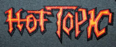 But it all started in that test period, when we designed what we called The Evil Sun Project, where we stacked screens on top of each other in a pyramid effect. As cool as it was, we never used the look or process until Hot Topic asked us to create a look that captures the feel of the brand. When we showed them the evil sun, they loved it, and so began the project.
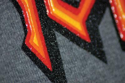
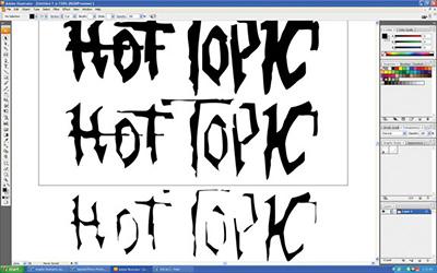
WYSINWYG
We started with the shape we built in Illustrator that was generally the customer’s logo type solution that had a tribal feel to it with its angular configuration. We placed this tribal shape and added several strokes around it to enlarge the overall shape. The separations and colorizing were a bit different than usual since we wanted to stack inks on each other for a dimensional, pyramid effect that would create a stair-stepped look.
As usual, we worked in Illustrator using a typical butt-to-butt registered separation. One of the advantages of Illustrator is that it uses the WYSIWYG (what you see is what you get) principle. But that’s not what we wanted in this case. Setting the colors on top of each other as is done for a normal vector separation wouldn’t allow us to stack the inks, the effect we are after, because normal separations knock the colors out of each other. For our three-dimensional look, we simply copied our original shape and added a four-point white stroke around it, creating a smaller/thinner choked version, leaving a space around the outside.
We repeated this process two more times, one with a six-point stroke and the other with a 12. We saved each of these files separately; each one under the other. Again, we didn’t want to stack the layers at this point as is typical because we were going to stack the ink at press; we would not be printing a standard, flat butt-to-butt registered graphic. We would be printing a solid color with another color on top, followed by another color on top of it in a pyramid, beveled appearance. The biggest image was first, followed by the next biggest and so on. Film was output in typical fashion on our inkjet-to-clear film, which provides a very opaque image area that minimizes undercutting in the screen department.

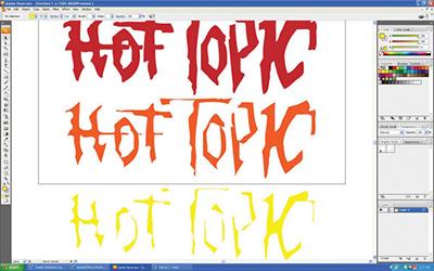
 Separations for the three screens were atypical because the inks were to be layered. Setting the colors on top of each other as is done in normal vector separation “knocks” the colors out of each other, accommodating for butt-to-butt registration, which wouldn’t allow the inks to be stacked.
Hard mixing
Choosing colors was easy because we had our sample print for reference. For this new image we would go with red, orange and yellow printed on black. Good fire colors, right? We mixed our inks using rock base, or granite as it is referred to, to match that red, orange and yellow using only 10 percent pigment. We could get great color with very clean pigments and this formulation would allow the base 90 percent of the mix to do what it was designed to do. We would sacrifice some opacity with the low pigment load, but we wouldn’t need it because of how thick an ink deposit we would lay down. The inks were a bit less viscous than most used in a high-density type of process, so new, sharp 80 durometer squeegees were going to be a must on this process.
Building critical mass
Screen making was the most critical part of this particular special effect. We went with 83 tpi with a 70 micron thread stretched to 30 N/cm. The thinner-than-standard thread allows thicker inks to transfer with ease and the small thread diameter allows for more open area, which means greater ink deposit with less resistance.
We would also apply a 400 micron capillary film stencil for all three screens. The thick stencil would facilitate the thick dimensional deposit we were trying to accomplish with crisp, sharp edges. Proper developing (washout) was critical for the points on this image. We soaked our exposed screens prior to washout to get the unexposed emulsion to literally drop out, leaving a nice clean stencil wall for that edge.
This design was only three screens and was a snap to set up. Each subsequent screen just needed to be centered in the last. Each color would need to be flashed and cooled before the next color could be placed on top. A total of seven stations would be used: printing the red first, flashed, cooled, the orange screen next, flashed and cooled again, and finally the yellow. Each screen’s off-contact was adjusted accordingly for each color as the stack progressed. Heavy flood and light print strokes were used respectively.
The belt speed of the dryer was adjusted down to assure the ink temperature reached full cure all the way through this extra-thick ink deposit. The inks actually melted down a bit through the chamber and the prints turned out great. The customer was happy and it looks like we will be developing some additional brands.

WYSINWYG
We started with the shape we built in Illustrator that was generally the customer’s logo type solution that had a tribal feel to it with its angular configuration. We placed this tribal shape and added several strokes around it to enlarge the overall shape. The separations and colorizing were a bit different than usual since we wanted to stack inks on each other for a dimensional, pyramid effect that would create a stair-stepped look.
As usual, we worked in Illustrator using a typical butt-to-butt registered separation. One of the advantages of Illustrator is that it uses the WYSIWYG (what you see is what you get) principle. But that’s not what we wanted in this case. Setting the colors on top of each other as is done for a normal vector separation wouldn’t allow us to stack the inks, the effect we are after, because normal separations knock the colors out of each other. For our three-dimensional look, we simply copied our original shape and added a four-point white stroke around it, creating a smaller/thinner choked version, leaving a space around the outside.
We repeated this process two more times, one with a six-point stroke and the other with a 12. We saved each of these files separately; each one under the other. Again, we didn’t want to stack the layers at this point as is typical because we were going to stack the ink at press; we would not be printing a standard, flat butt-to-butt registered graphic. We would be printing a solid color with another color on top, followed by another color on top of it in a pyramid, beveled appearance. The biggest image was first, followed by the next biggest and so on. Film was output in typical fashion on our inkjet-to-clear film, which provides a very opaque image area that minimizes undercutting in the screen department.
Hard mixing
Choosing colors was easy because we had our sample print for reference. For this new image we would go with red, orange and yellow printed on black. Good fire colors, right? We mixed our inks using rock base, or granite as it is referred to, to match that red, orange and yellow using only 10 percent pigment. We could get great color with very clean pigments and this formulation would allow the base 90 percent of the mix to do what it was designed to do. We would sacrifice some opacity with the low pigment load, but we wouldn’t need it because of how thick an ink deposit we would lay down. The inks were a bit less viscous than most used in a high-density type of process, so new, sharp 80 durometer squeegees were going to be a must on this process.
Building critical mass
Screen making was the most critical part of this particular special effect. We went with 83 tpi with a 70 micron thread stretched to 30 N/cm. The thinner-than-standard thread allows thicker inks to transfer with ease and the small thread diameter allows for more open area, which means greater ink deposit with less resistance.
We would also apply a 400 micron capillary film stencil for all three screens. The thick stencil would facilitate the thick dimensional deposit we were trying to accomplish with crisp, sharp edges. Proper developing (washout) was critical for the points on this image. We soaked our exposed screens prior to washout to get the unexposed emulsion to literally drop out, leaving a nice clean stencil wall for that edge.
This design was only three screens and was a snap to set up. Each subsequent screen just needed to be centered in the last. Each color would need to be flashed and cooled before the next color could be placed on top. A total of seven stations would be used: printing the red first, flashed, cooled, the orange screen next, flashed and cooled again, and finally the yellow. Each screen’s off-contact was adjusted accordingly for each color as the stack progressed. Heavy flood and light print strokes were used respectively.
The belt speed of the dryer was adjusted down to assure the ink temperature reached full cure all the way through this extra-thick ink deposit. The inks actually melted down a bit through the chamber and the prints turned out great. The customer was happy and it looks like we will be developing some additional brands.
About the Author
- Email Address lon@graphicelephants.com
Industry consultant Lon Winters is president of Print This, Inc. and Graphic Elephants, LLC. During more than twenty years in screen printing, he has won more than 40 international industry awards. Those include SGIA Golden Image Awards, Printwear Awards, Impressions Awards, and FESPA Honors. He is an honorary Golden Image judge; has published numerous articles and monthly columns; and leads seminars and workshops for a wide array of industry professionals.
Since the day he began his career by reclaiming screens, Lon has been involved in virtually every aspect of screen printing and embroidery. After managing operations large and small, Lon launched businesses dedicated to training, and consulting.
Print This conducts popular seminars and workshops around the world for manufacturers, vendors, and garment decorators.
Graphic Elephants is a screen print and embroidery design and development studio specializing in new techniques for clients with high-end work and short lead times.
Located in Elizabeth, Colorado, Lon can be reached by phone at 303-910-0477 and by email at lon@graphicelephants.com. His website is www.GraphicElephants.com.