A few years ago, we were exhibiting at The NBM Show in Charlotte, N.C. (you can find us at all of the NBM shows) when we met what turned out to be some new good friends. Dick and Darlene from Signet Screen Printing and Embroidery introduced themselves and we made an instant connection.
They had purchased their business a number of years ago and wanted help getting to the next level. Among many topics on this subject, we discussed printing on black shirts. Since that’s what we do, we worked out an arrangement to visit and spend a week with them after the first of the year.
Late on Super Bowl Sunday, we flew into our nation’s capital and continued on to Winchester, Va., a cute little town nestled in the heart of our nation’s hotbed of early American history. Dick saw to it that we would learn a little history during our visit.
We arrived early the next morning at the factory, got the tour and met all the people we would be working with. As we began to settle in for the week and dial in an outline, one of the salespeople had a client, Why Not Antiques, with a pending T-shirt print order in queue. This client had the rights to some very old historical postcard art and was planning to print the first on white shirts.
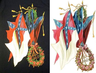 The artwork consisted of, literally, a postcard sized scan. With a little Photoshop magic dispensed by the artist’s skilled fingertips, the design worked out well. (Images courtesy the author)
The folks at Signet were fairly proficient at basic four-color process on white and were getting good results. However, since we would be focusing on dark and black shirt printing during our visit, the salesperson let the cat out of the bag. So, before we even started the learning curve, the sales staff had already sold a job. Typical isn’t it? It would be okay though, we had a template to run through the whole process. Sometimes things just work out.
 Blue and Gold
Art history
So we began. Lea Anna in the art department was a champ and would do the heavy lifting. Upon further examination, this “postcard” art was simply a scan of a postcard at original (postcard) size. As we blew up this raster image to a full-front T-shirt size, we could see the patterns of the halftones in the original four-color process paper print forming. We explained to the customer why this happened, and he decided he liked the look. The image almost took on the texture that the original painting would have had on canvas.
The next hurdle: The scan included the white flattened background. We would need to remove the image from the background and replace it with the garment color, thus leaving it transparent. Not all that difficult, but a bit time consuming. Because the image is complex—doesn’t have hard edges—we can’t just select and make a clipping path like we might for a vector type file.
 Green and Red
 Red, Blue, Green and Gold and White base
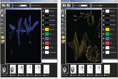
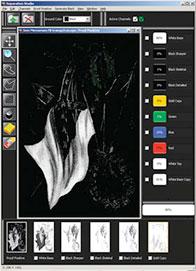
Instead, we opened up our channels in Photoshop with the image as an RGB file. We created our alpha mask by duplicating the blue channel and setting it to Apply Image. We then changed it to the green and finally red channels while leaving the Blending set to Multiply and Opacity at 100 percent. This technique applies all the color data to one channel.
We filled in the white (or lack of color) by painting it in with our brush tool, blowing up the image extremely large to see what we were working with. With the RGB preview channel selected, we Loaded Selection for New Selection where the marching ants appeared around our image. We did a quick copy and paste and we were there. We laid in a black background to see how it looked and, with a little time with the brush, got to where we wanted to be.
 White highlights
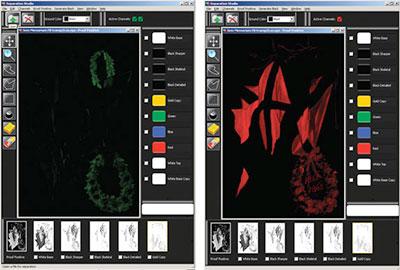
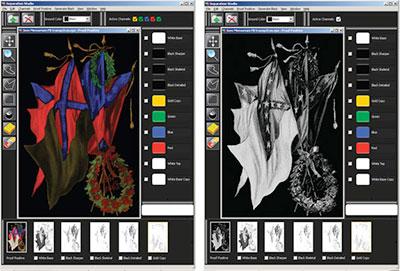
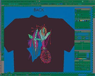
Once on our transparent background, we worked a little magic to optimize our file for separations. We juiced up the colors a bit and changed some of the type color at the customer’s request. We increased the contrast and made our black area very black and white areas nice and white. Once imported into separation software, the actions were complete and we could eliminate the plates we did not need.
We rarely use the gray plate and this was no exception. We merged a few plates and added some information to the green plate as some areas looked a bit brown on the preview, where our interpretation was more a bit more fragrant. We chose black for the detail because this image would be printed on a number of colors other than black as well. We choked the first-down white printer a bit and were ready for output.
One more hiccup at output—the device and RIP software they were using were so old we had never heard of either. It was amazing that the good people at Signet had even been able to make it work at all. Duct tape and bailing wire held it all together. Somehow we were able to get some semblance of usable film thanks to the creative solutions these folks could come up with. Joan and Lea Anna were the heroes for keeping this dinosaur functional for so long. Needless to say, a new inkjet output device and up-to-date RIP have since been installed.
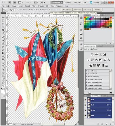 Image prep in Photoshop
Screening session
We took our film to the screen department, where the production manager and master printer, AJ, took over. We exposed our white printer on a 156 tpi and the balance of the colors all on 230s. All were freshly rebuilt retensionable frames at 30 N/cm2 that we reintroduced while working with our new friends.
 Back proof
After verifying good coating techniques and right-on exposures with the quality dual cure emulsion they were using, we got very good screens with a good eom (emulsion over mesh) percentage. We chose fairly straight-forward inks on this, building our print order beginning with the first white and then a flash followed by a cool station. The sequence thereafter was: black, the less predominant colors (gold and green), blue followed by the red and finally the highlight white printed last.
We sharpened a set of 70 durometer squeegees and, since the automatic used here had the V-type setup, we put a fresh set of 80s on the flood side. After several test prints, we were ready to show the salesperson and, more importantly, the client. He was pleased, to say the least, and the folks at Signet are working on several new images all taken from vintage postcards.
Dick and Darlene drove us back to the airport, but not before a tour of our nation’s capital and a bit of a history lesson. After all was said and done, we think Signet Screen Printing and Embroidery is ready to take the next step and bring their printing to that next level. We are so glad we could help. They are a great group and certainly treated us very well. We look forward to seeing more work from our new friends.

They had purchased their business a number of years ago and wanted help getting to the next level. Among many topics on this subject, we discussed printing on black shirts. Since that’s what we do, we worked out an arrangement to visit and spend a week with them after the first of the year.
Late on Super Bowl Sunday, we flew into our nation’s capital and continued on to Winchester, Va., a cute little town nestled in the heart of our nation’s hotbed of early American history. Dick saw to it that we would learn a little history during our visit.
We arrived early the next morning at the factory, got the tour and met all the people we would be working with. As we began to settle in for the week and dial in an outline, one of the salespeople had a client, Why Not Antiques, with a pending T-shirt print order in queue. This client had the rights to some very old historical postcard art and was planning to print the first on white shirts.
The folks at Signet were fairly proficient at basic four-color process on white and were getting good results. However, since we would be focusing on dark and black shirt printing during our visit, the salesperson let the cat out of the bag. So, before we even started the learning curve, the sales staff had already sold a job. Typical isn’t it? It would be okay though, we had a template to run through the whole process. Sometimes things just work out.
Art history
So we began. Lea Anna in the art department was a champ and would do the heavy lifting. Upon further examination, this “postcard” art was simply a scan of a postcard at original (postcard) size. As we blew up this raster image to a full-front T-shirt size, we could see the patterns of the halftones in the original four-color process paper print forming. We explained to the customer why this happened, and he decided he liked the look. The image almost took on the texture that the original painting would have had on canvas.
The next hurdle: The scan included the white flattened background. We would need to remove the image from the background and replace it with the garment color, thus leaving it transparent. Not all that difficult, but a bit time consuming. Because the image is complex—doesn’t have hard edges—we can’t just select and make a clipping path like we might for a vector type file.
Instead, we opened up our channels in Photoshop with the image as an RGB file. We created our alpha mask by duplicating the blue channel and setting it to Apply Image. We then changed it to the green and finally red channels while leaving the Blending set to Multiply and Opacity at 100 percent. This technique applies all the color data to one channel.
We filled in the white (or lack of color) by painting it in with our brush tool, blowing up the image extremely large to see what we were working with. With the RGB preview channel selected, we Loaded Selection for New Selection where the marching ants appeared around our image. We did a quick copy and paste and we were there. We laid in a black background to see how it looked and, with a little time with the brush, got to where we wanted to be.
Once on our transparent background, we worked a little magic to optimize our file for separations. We juiced up the colors a bit and changed some of the type color at the customer’s request. We increased the contrast and made our black area very black and white areas nice and white. Once imported into separation software, the actions were complete and we could eliminate the plates we did not need.
We rarely use the gray plate and this was no exception. We merged a few plates and added some information to the green plate as some areas looked a bit brown on the preview, where our interpretation was more a bit more fragrant. We chose black for the detail because this image would be printed on a number of colors other than black as well. We choked the first-down white printer a bit and were ready for output.
One more hiccup at output—the device and RIP software they were using were so old we had never heard of either. It was amazing that the good people at Signet had even been able to make it work at all. Duct tape and bailing wire held it all together. Somehow we were able to get some semblance of usable film thanks to the creative solutions these folks could come up with. Joan and Lea Anna were the heroes for keeping this dinosaur functional for so long. Needless to say, a new inkjet output device and up-to-date RIP have since been installed.
Screening session
We took our film to the screen department, where the production manager and master printer, AJ, took over. We exposed our white printer on a 156 tpi and the balance of the colors all on 230s. All were freshly rebuilt retensionable frames at 30 N/cm2 that we reintroduced while working with our new friends.
After verifying good coating techniques and right-on exposures with the quality dual cure emulsion they were using, we got very good screens with a good eom (emulsion over mesh) percentage. We chose fairly straight-forward inks on this, building our print order beginning with the first white and then a flash followed by a cool station. The sequence thereafter was: black, the less predominant colors (gold and green), blue followed by the red and finally the highlight white printed last.
We sharpened a set of 70 durometer squeegees and, since the automatic used here had the V-type setup, we put a fresh set of 80s on the flood side. After several test prints, we were ready to show the salesperson and, more importantly, the client. He was pleased, to say the least, and the folks at Signet are working on several new images all taken from vintage postcards.
Dick and Darlene drove us back to the airport, but not before a tour of our nation’s capital and a bit of a history lesson. After all was said and done, we think Signet Screen Printing and Embroidery is ready to take the next step and bring their printing to that next level. We are so glad we could help. They are a great group and certainly treated us very well. We look forward to seeing more work from our new friends.
About the Author
- Email Address lon@graphicelephants.com
Industry consultant Lon Winters is president of Print This, Inc. and Graphic Elephants, LLC. During more than twenty years in screen printing, he has won more than 40 international industry awards. Those include SGIA Golden Image Awards, Printwear Awards, Impressions Awards, and FESPA Honors. He is an honorary Golden Image judge; has published numerous articles and monthly columns; and leads seminars and workshops for a wide array of industry professionals.
Since the day he began his career by reclaiming screens, Lon has been involved in virtually every aspect of screen printing and embroidery. After managing operations large and small, Lon launched businesses dedicated to training, and consulting.
Print This conducts popular seminars and workshops around the world for manufacturers, vendors, and garment decorators.
Graphic Elephants is a screen print and embroidery design and development studio specializing in new techniques for clients with high-end work and short lead times.
Located in Elizabeth, Colorado, Lon can be reached by phone at 303-910-0477 and by email at lon@graphicelephants.com. His website is www.GraphicElephants.com.